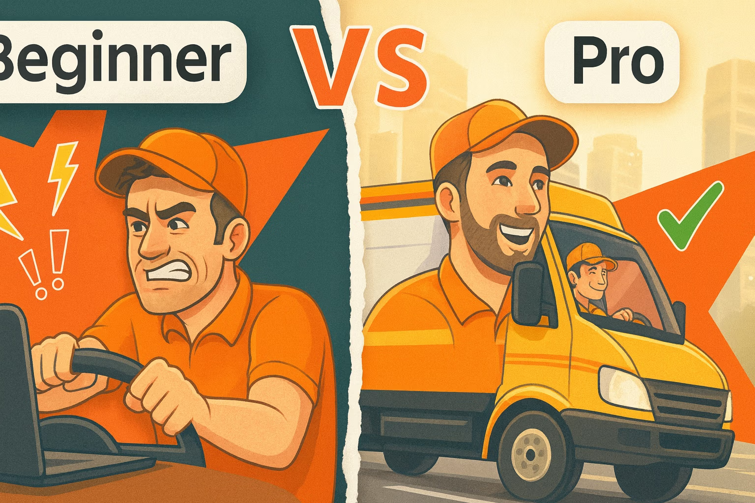
When Bandit Express came to us, they had a brochure created in Microsoft Word — functional, but lacking the visual appeal and professionalism needed to represent a growing logistics company. Their goal was to create something clean, organized, and modern that communicated their services clearly and gave their brand a stronger visual identity.
Before: The Starting Point
The client provided a scanned copy of their existing brochure — a simple, text-heavy layout built from a Word template. It contained essential information, but it was visually flat, difficult to follow, and lacked structure. Without a clear design hierarchy, the eye had nowhere to go. The absence of a brand logo or cohesive color palette made the piece feel generic, rather than representative of a reliable, established company.
After: The Design Transformation
We started by establishing a consistent brand identity. Using colors pulled from their website, we developed a clean, professional palette and modern typography that immediately elevated the look and feel.
To give the brochure a sense of motion and energy—key traits in the transportation industry—we added dynamic graphic elements that represent movement and direction. We also created a brand-new logo for Bandit Express, giving them a recognizable mark to use across their materials.
Inside, we rebuilt the layout with more white space and clear section breaks, organizing the content so readers could easily navigate through their services and coverage areas. The addition of the custom map and supporting visuals made the brochure not only more informative but visually engaging.
The final result is a colorful, cohesive, and memorable design that captures the company’s professionalism and builds credibility with their customers.
Key Takeaway
This project shows how thoughtful design can turn a basic, text-heavy document into a professional marketing piece that builds trust and elevates your brand. With consistent branding, clear messaging, and strong visual hierarchy, even a simple company overview can become a powerful sales tool.
Have a design project in mind? Our team specializes in custom graphic design and marketing materials that make your brand stand out. Get in touch with our designers today to start your next project.

